
Basics 01
So here I am with a series of chapters, in which I am going to tell you about the basics of composition and layout, photography, typography, etc. This series will surely give an idea to the beginners what they are stepping into and what basics they must know. This series will have Six chapters. I hope you are going to like it.
Chapter 1: Composition and Layout
So as it is clear by the title of the chapter that we are going to read and learn about the composition and layout, but 'what is composition?'
Composition - Arrangement of design elements that form a whole image. A good composition will attract the viewer's attention and aides the eyes around the picture. A composition can be of anything. It is usually known as 'FORM' in visual art, And also known as 'LAYOUT' in graphic design.
Now let's see what are the Six elements of a composition:-
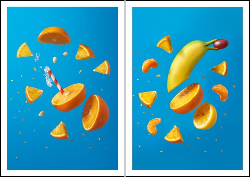
1. Balance - It is the arrangement or we can say the placement of the elements in a composition so that the text and graphics are evenly distributed across the image having a focus point on the center and the person seeing it can have the feeling that the composition is balanced. Now there are three types of balances, symmetrical, Asymmetrical, and Radial.
- Symmetrical - In this type of balance the elements are even on both sides of the composition whether it is horizontal or vertical.
- Asymmetrical - When not equal on both sides. it can be graphic on one side and text on one.
- Radical - In this type of balance the elements are even on all the sides from the central point, creating radial balance.
2. Contrast - It is achieved by including elements within the design that look measurably different from one another. A designer may use color, shape texture, size or typeface, etc to create contrast. For example, two different color circles are placed at an equal distance from the center.
3. Repetition - This is very much understood by its name. It is the number of times you repeat an element, maintain a unified look, for example, three vertically placed circles on both sides of the sheet at equal distance from the center.
4. White space - This is also known as negative space. A space unmarked by any element, basically it is empty. The blank space. It is really important to make an image attractive. One should deliberately leave the white space because this is the one thing that ensures attention.
5. Alignment - This is known as the position of the graphics or the texts. There are 4 types of alignments - left, right, center, and justified.
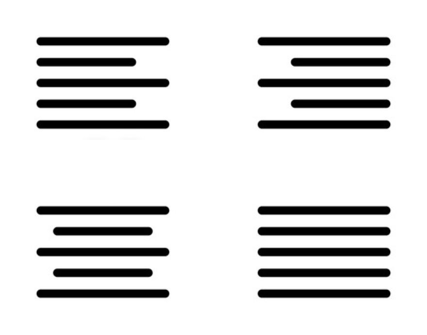
- Left - In this the entire element starts from the left side.
- Right - In this, the entire element starts from the right side.
- Centre - As the name suggests itself the element is on the center.
- Justified - The element starts from the left margin but the spacing is done in such a manner that the elements come between both the margins.
6. Proximity - This is how design elements are grouped or spaced on a page. The grouping is really important to make a composition because a composition always consists of more than one element.
Other than the components of composition there are few more things to keep in mind.
- Thumbnail sketch - Small rough drawing to explore and brainstorm your ideas.
- Hierarchy - In this the elements are organized or arranged according to the importance. It can start from most important and go till least or it can start from least and go till most important.
- Rule of third - This technique is used to determine the focal point in a composition which is then used to place all the elements.
- Scale - This is considered as the size of the element or object concerning the other object or element.
- Grids - These are known as the series of intersections. Grids consist of vertical, horizontal, curved, or angular lines.